(Optional) Forms in Flutter
- Objectives
- Code along
- Forms in Flutter
- Implementing a simple “Sign Up” form
- Structural widgets
- Other Resources
Objectives
- to introduce Forms and their roles in app development in general
- to implement a simple form with validation in Flutter
- to introduce some of Flutter’s built-in Stateful widgets
Code along
Recording: https://youtu.be/Ld-xgXDi98o
Forms in Flutter
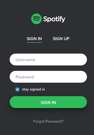
A form is a set of input fields that collects a set of related information from a user, for example, a login page requesting a username and password.
Forms in Flutter often entail a TextField or other input widget where the user has substantial control over what is inputted.
Form inputs should be validated, meaning that the values the user inputs should be checked against a definition of what is allowable. For example, the username and password in a login form should not be left blank. A sign-up form requesting the user’s email and a password should check that the email address is in a valid format and that the password meets minimum strength requirements (more than 8 characters, 1 letter, 1 number, 1 symbol, etc.).
Form validation also entails providing the user with explicit feedback on both what errors they made and how to correct those errors. For example:
- Displaying an error of “Bad password” is not sufficient. It says what the error is but not how to fix it; the app should provide the password strength requirements.
- Simply highlighting in red a required field that the user left blank is not sufficient. The app should explicitly state “You must provide a username.”
Implementing a simple “Sign Up” form
We are going to implement the user interface for a simple (and incomplete) sign-up form to demonstrate Form inputs and validation. We are not going to implement any actual sign-up logic where a user account is created and saved to a database.
Boilerplate
- Create a new Flutter application (Command Palette -> Flutter: New Project) and name it “sign_me_up”
- Replace the boilerplate code in
main.dartwith the following:
import 'package:flutter/material.dart';

void main() {
  // We implement our pattern of main() creating a new MaterialApp whose
// "home" is the starting screen.
  runApp(const MaterialApp(title: "Sign Me Up!", home: RegisterScreen()));
}

// This is our home screen. It will hold the sign-up form.
// Remember that a Scaffold is the basic element of a single "screen" or "page" in a Flutter app.
class RegisterScreen extends StatelessWidget {
  const RegisterScreen({super.key});

  @override
  Widget build(BuildContext context) {
    return Scaffold(
      appBar: AppBar(
        title: const Text("Sign Me Up!"),
      ),
      body: const Padding(padding: EdgeInsets.all(12), child: SignUpForm()),
    );
  }
}

// We are creating a custom StatefulWidget that will compose the Form
// and its child input elements. We need a StatefulWidget because the elements
// drawn on the screen will change in response to user input.
class SignUpForm extends StatefulWidget {
  const SignUpForm({super.key});

  @override
  State<SignUpForm> createState() => _SignUpFormState();
}

class _SignUpFormState extends State<SignUpForm> {
  @override
  Widget build(BuildContext context) {
    return Container();
  }
}
The RegisterScreen widget provides the scaffolding for our sign-up page. We want to follow the pattern of defining one Widget to represent a single screen in our application. The Scaffold provides the basic elements of a screen. There must be only one Scaffold on a logical screen.
The SignUpForm is a custom Stateful widget that will actually house our Form and its child input widgets, like text fields, checkboxes, and buttons.
The Form widget
Flutter provides a Form widget that functions as a “container for grouping together multiple form field widgets”.
The Form widget itself is not visible on the screen. It is an invisible container, much like a <form> or <div> tag in HTML. It is used to create a logical grouping of other widgets.
The plan for our sign-up form is to have the following:
- A TextFormField for email
- A TextFormField for a password
- A Checkbox for the user to accept the Terms & Conditions of our app
- An ElevatedButton that will be the “submit button” for our form. You don’t have to use an ElevatedButton, you could use custom widgets like we designed in our CollageApp in previous labs. The ElevatedButton is available for convenience.
Create the state variables
Define the following class variables in _SignUpFormState:
String? email;String? password;bool isChecked = false;These are our state variables. We will update them based on the user’s input to our form.
Specify the Form’s contents
Replace the _SignUpFormState widget’s build() method with the following:
  @override
  Widget build(BuildContext context) {
    // The Form widget is invisible, but it groups other widgets.
    return Form(
      child: Column(
        children: <Widget>[
          TextFormField(
            decoration: const InputDecoration(hintText: 'Enter your email'), // Place "hint" text inside the field.
            maxLength: 64,  // Limits the number of characters and provides a counter.
            onChanged: (value) => email = value,
          ),
          TextFormField(
            decoration: const InputDecoration(hintText: "Enter a password"),
            obscureText: true,  // Show obscuring dots rather than characters.
            onChanged: (value) => password = value,
          ),
          Row(
            children: [
              Checkbox(
                value: isChecked, // The Checkbox's appearance depends on the value of isChecked
                onChanged: (value) {
                  isChecked = value!; // Update the state
                  setState(() {}); // We need to trigger a rebuild of our Form because the checkbox changed.
                },
              ),
              const Text("I agree to the Terms and Conditions of this site.")
            ],
          ),
          ElevatedButton(
              child: const Text('Submit'),
              onPressed: () {
                // TODO:
                // Here is where we want to validate the form.
                // If all of the form contents are valid (fields filled in and checkbox checked), then do something.
                // If any of the form contents are invalid, display error messages to the user.
              })
        ],
      ),
    );
  }
The TextFormField and Checkbox widgets are built-in to Flutter. They are stateful widgets.
onChanged
Both the TextFormField and Checkbox widgets have attributes called onChanged. onChanged takes an anonymous function as its argument that will be executed whenever the user types something in the checkbox or clicks the textbox.
Consider the line onChanged: (value) => email = value, from the first TextFormField. The syntax for this anonymous function is different from previous examples. First, the anonymous function has a single parameter, value, which is required by Flutter and will always contain the current value of the TextFormField. The => operator is shorthand for a single-line function. The following lines of code are functionally the same:
onChanged: (value) => email = value,
onChanged: (value) { email = value; }
The first line is short-hand for the second line – less curly braces to get confused with. Both are correct syntax. However, you must use the second form if your function has multiple lines, like we do in the onChanged property of the Checkbox:
// We must use the second form because our anonymous function has multiple lines.
onChanged: (value) {
    isChecked = value!; // Update the state
    setState(() {}); // We need to trigger a rebuild of our Form because the checkbox changed.
},
Updating the Checkbox
In the two TextFormFields, their onChanged properties update the email and password state variables only. In the Checkbox, it’s onChanged property updates isChecked and calls setState(), which if you recall triggers a rebuild of our Stateful widget. Why does it need to do this?
Notice how the Checkbox has a property called value – this specifies whether the checkbox is checked or not. The Checkbox doesn’t handle “checking” and “unchecking” automatically. You, the programmer, has to do with it. The line value: isChecked tells the Checkbox to customize its look based on the value of our state variable isChecked.
So here is the process and the reason why our Form needs to be in a StatefulWidget:
- The
build()method of our StatefulWidget is called, wherein the Checkbox is initialized to checked ifisChecked == trueor unchecked ifisChecked == false. Note that we declaredbool isChecked = false;to start with. - The user clicks the checkbox, which triggers the
onChangedproperty of the checkbox. The anonymous function then:- updates the state variable
isCheckedto match the new value to flip true-to-false or vice versa; - calls the inherited function
setState()
- updates the state variable
setState()triggers a rebuild of our StatefulWidget, which leads back to Step
Validating the form’s contents
We have a Form in our UI, and changes to the form update our state variables. Now, as app developers, we want to validate our form fields to ensure all their values are acceptable.
“validator” properties
TextFormField widgets have a property called validator that takes an anonymous function. This function contains whatever logic you desire to determine if the text input is acceptable or not. For example, you can write Dart code to ensure the email text is of the from a@b.com, and to ensure that the password text is at least 12 characters, contains a number, a letter, and a symbol, etc. What determines “validity” is up to you.
A TextFormField’s validator function:
- has one parameter for the value of the box
- must return either:
- a String that will be the error message, e.g., “Username cannot be blank”
nullto indicate that there is no error.
Change the TextFormFields to the following to include the validator:
TextFormField(
    decoration: const InputDecoration(hintText: 'Enter your email'), // Place "hint" text inside the field.
    maxLength: 64, // Limits the number of characters and provides a counter.
    onChanged: (value) => email = value,
    validator: (value) {
    if (value == null || value.isEmpty) {
        return 'Please enter some text';
    }
    return null; // Returning null is good - it means "no issue with this field"
    }),
TextFormField(
    decoration: const InputDecoration(hintText: "Enter a password"),
    obscureText: true, // Show obscuring dots rather than characters.
    onChanged: (value) => password = value,
    validator: (value) {
    if (value == null || value.length < 8) {
        return 'Your password must contain at least 8 characters.';
    }
    return null; // Returning null is good - it means "no issue with this field"
    }),
Our validator for the “email” text is only that the email cannot be blank. Our validator for the “password” text requires that the password be at least 8 characters. Again, you can write whatever sophisticated logic you want here to determine “validity”.
Right now, these validators don’t run. We need to write code to trigger them.
GlobalKey and triggering the validation
We want to trigger the validation of our form’s fields in the “Submit” button’s onPressed event. One of the benefits of the Form widget is the ability to invoke all the validators on its children (the TextFormFields) and aggregate the results. To make use of this ability, we need to be able to access the Form widget from inside the ElevatedButton. For this, we need a GlobalKey.
A GlobalKey is a class that effectively provides a unique identifier for a widget so that the widget can be accessed from anywhere (globally) in the widget tree. Remember that the ElevatedButton is actually a child nested down inside the Form. First, give the form a GlobalKey by doing the following:
- In
_SignUpFormState, declare the class variablefinal _formKey = GlobalKey<FormState>(); - In the
Form()constructor, add the propertykey: _formKey,
So the beginning of your _SignUpFormState should look like the following:
class _SignUpFormState extends State<SignUpForm> {
  // These are our "state variables". They will be updated with the form fields' contents
  bool isChecked = false;
  String? email;
  String? password;

  final _formKey = GlobalKey<FormState>();

  @override
  Widget build(BuildContext context) {
    // The Form widget is invisible, but it groups other widgets.
    return Form(
      key: _formKey,
      child: Column(
We can now use _formKey to access the Form widget from within our ElevatedButton. Update your ElevatedButton to the following:
ElevatedButton(
    child: const Text('Submit'),
    onPressed: () {
        // Here is where we want to validate the form.
        // If all of the form contents are valid (fields filled in and checkbox checked), then do something.
        // If any of the form contents are invalid, display error messages to the user.
        if (_formKey.currentState!.validate() && isChecked) { // This calls all validators() inside the form for us.
            print("New user signup. Email: $email, Password: $password");
        } else {
            print("An error occurred during user signup!");
        }
    })
Note the if-statement, which prints a success or failure message. The clause _formKey.currentState!.validate() accesses our Form widget using the global key and collects the results of all the validators in the form fields. If all validators return null, the result of this clause will be true. If any validator returns non-null, the result of this clause will be false.
We add the isChecked clause to the if-statement to ensure that the Terms and Conditions checkbox is currently checked.
If the if-statement is true, we print out a success message. If it’s false, we print an error message. In reality, we would do something more here, like save the user’s information to a database and take them to a splash page.
Providing additional user feedback
We now have validation in place. One principle of UI design is that every user action should have feedback. Red text will display if the TextFormFields are invalid. We also need to provide some feedback for the checkbox, and feedback when the user submits a valid form.
The Checkbox does not have a validator property. We instead have to create our own text feedback. We can do this by conditionally displaying a widget. Add the following snippet between the Row and the ElevatedButton widgets in the Column:
    if (!isChecked)
      Text(
        "You must accept the Terms and Conditions to proceed.",
        style: TextStyle(color: Colors.red[800], fontSize: 12),
      ),
This snippet checks our isChecked state variable and, if it is false (not checked), will include the Text widget in the widget tree. If isChecked is true, the widget will not be shown. Note that this snippet is one logical statement:
if (!isChecked) Text("You must accept the Terms and Conditions to proceed.",style: TextStyle(color: Colors.red[800], fontSize: 12),),
You can write any if-condition you want, but it can only be one logical line if you want to conditionally include a widget in a Row() or Columns() children.
The general formula is if(condition) Widget(..). The Widget will be shown if the condition is true, and not shown if false.
So, now, we show a warning to the user to accept the Terms and Conditions if the checkbox is not checked.
Snackbars
If the form data is valid, our app should “do something” related to signing up, such as saving their information to a database and taking them to our app’s “home page”. We’re not going to do that in this example. However, we should give the user some feedback that their sign-up was successful.
Snackbars are a material design element that create a pop-up with a short messages that will disappear after a few seconds. Snackbars are easy to create and are displayed within a Scaffold. You can create one from any child widget nested within a Scaffold.
Change your ElevatedButton to the following:
ElevatedButton(
child: const Text('Submit'),
onPressed: () {
// Here is where we want to validate the form.
// If all of the form contents are valid (fields filled in and checkbox checked), then do something.
// If any of the form contents are invalid, display error messages to the user.
if (_formKey.currentState!.validate() && isChecked) {
// This calls all validators() inside the form for us.
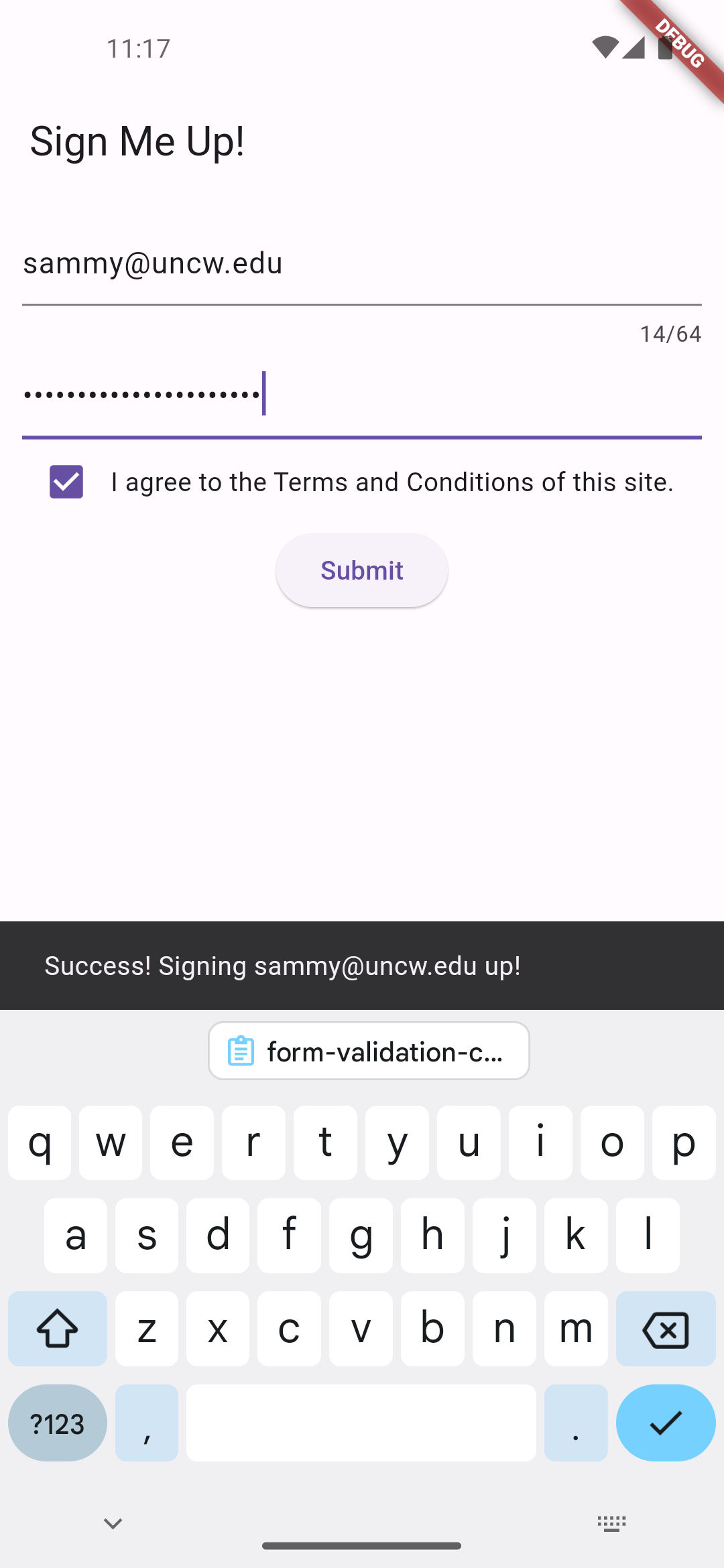
ScaffoldMessenger.of(context).showSnackBar(
SnackBar(content: Text('Success! Signing $email up!')),
);
print("New user signup. Email: $email, Password: $password");
} else {
print("An error occurred during user signup!");
ScaffoldMessenger.of(context).showSnackBar(
const SnackBar(content: Text('Fix any errors and agree to the Terms and Conditions!')),
);
}
})
You should now see a little pop-up at the bottom when the user clicks the submit button. The recipe for a Snackbar always follows this pattern.
And that’s it. We have a minimally functional sign-up form. Download the completed main.dart.
Structural widgets
- Form - container for grouping together multiple form field widgets. It does not actually draw anything on the screen, but is useful for validation and saving form data.
- TextFormField - A text field lets the user enter text, either with hardware keyboard or with an onscreen keyboard.
- Checkbox - a checkbox on the screen whose appearance depends on an initial boolean value (checked or not checked).