Rows and Columns
- Objectives
- Class video
- Boilerplate
- Layout widgets, Rows, and Columns
- Row and Column “alignment” properties
- Row and Column size
- Conclusion
- Other Resources
Objectives
- To understand how to use Columns and Rows to arrange widgets
- To understand the
mainAxisAlignmentandcrossAxisAlignmentproperties of Row and Column widgets - To understand the implications of the
mainAxisSizeproperty
Class video
Boilerplate
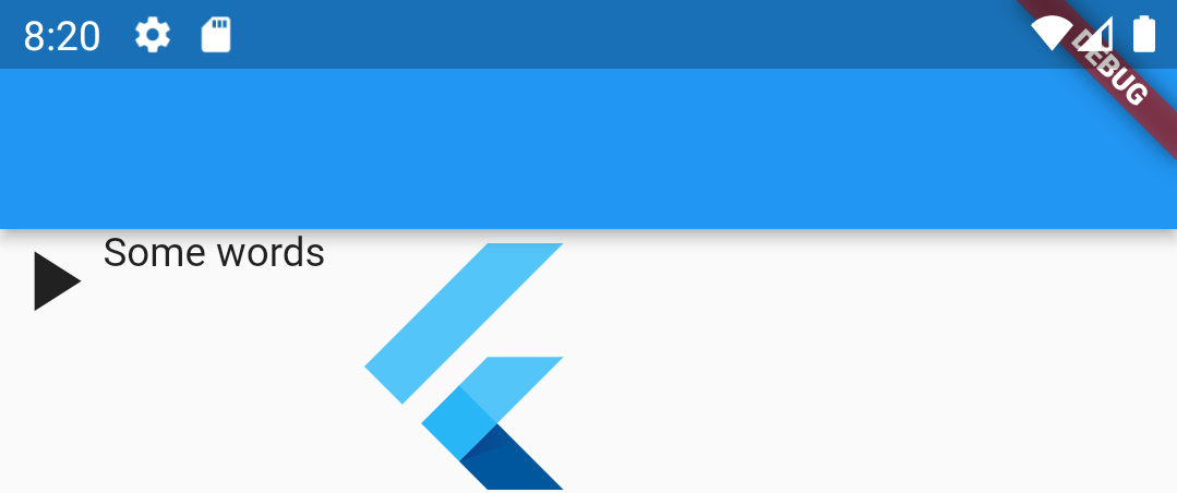
Create a new Flutter project and replace the starter code in main.dart with the following:
import 'package:flutter/material.dart';
void main() {
runApp(const MaterialApp(title: "Rows/Columns", home: HomeScreen()));
}
class HomeScreen extends StatelessWidget {
const HomeScreen({super.key});
@override
Widget build(BuildContext context) {
return Scaffold(
appBar: AppBar(title: Text("Rows/Columns"), backgroundColor: Colors.grey),
body: DecoratedBox(
decoration: BoxDecoration(
border: Border.all(width: 4, color: Colors.purple),
),
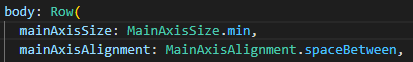
child: Row(
mainAxisSize: MainAxisSize.max,
mainAxisAlignment: MainAxisAlignment.start,
children: [
Icon(Icons.play_arrow, size: 36),
Text("Some words"),
FlutterLogo(size: 96),
],
),
),
);
}
}
Layout widgets, Rows, and Columns
The term layout refers to how visible widgets are arranged on the screen. In Flutter, layout widgets are how you properly place items on the screen. Layout widgets are invisible themselves – they only arrange their children.
Row and Column are two of the most common layout widget in Flutter apps. A Row displays its children in a horizontal array, and a Column displays its children in a vertical array.
The Row and Column widgets both have a children: property. The children are the other widgets you want to arrange. The children can be visible widgets, such as Buttons, Images, or Texts. The children can also be invisible widgets and other layout widgets, including Row and Column widgets. You can also mix visible widgets with invisible widgets. You can achieve complex layouts by nesting Rows and Columns within one another if you so choose. We will also look at some more high-level layout widgets, such as Grids, in future labs.
Row and Column “alignment” properties
Rows arrange widgets horizontally and Columns stack widgets vertically. You can also control the position of the child widgets within a Row or Column through two properties: mainAxisAlignment and crossAxisAlignment, illustrated below:
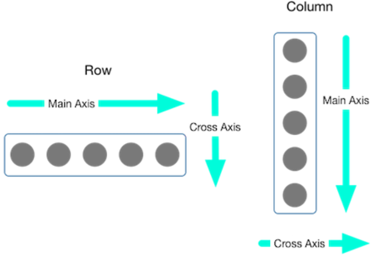
The main axis for a Column is the vertical axis and for a Row is the horizontal axis. The cross axis is the other axis: horizontal for Column and vertical for Row.
You control the placement of child widgets within a Row or column by specifying the alignment of each axis. Alignments are similar to “justification” in typesetting - you can be left-justified or right-justified. The alignment properties also have settings for spacing between widgets.
MainAxisAlignment
Row and Column widgets have an optional mainAxisAlignment: property. If you do not set this property, it will have the value MainAxisAlignment.start, which corresponds to the beginning of a Row and the top of a Column. In our boilerplate code, we (redundantly) set mainAxisAlignment: MainAxisAlignment.start,.
The main axis has 6 alignment options:
| main axis alignment | Row | Column |
|---|---|---|
| "start" | left | top |
| "end" | right | bottom |
| "center" | horizontal middle | vertical middle |
| "space between" | Place the free space evenly between the children. | |
| "space around" | Place the free space evenly between the children as well as half of that space before and after the first and last child. | |
| "space evenly" | Place the free space evenly between the children as well as before and after the first and last child. | |
The effects of the various MainAxisAlignment values on a Row are shown below:
MainAxisAlignment.start |
 |
MainAxisAlignment.center |
 |
MainAxisAlignment.end |
 |
MainAxisAlignment.spaceBetween |
 |
MainAxisAlignment.spaceEvenly |
 |
MainAxisAlignment.spaceAround |
 |
Exercise: Change the Row widget to a Column and try the different MainAxisAlignment values. You will see they are visually the same as a Row, except rotate 90° clockwise.
CrossAxisAlignment
Row and Column widgets have an optional crossAxisAlignment: property. You specify this property by saying, for example, crossAxisAlignment: CrossAxisAlignment.center. Here is an excerpt for the Row widget in our boilerplate:
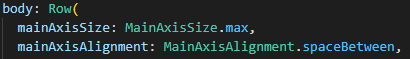
Row(
  mainAxisSize: MainAxisSize.max,
  crossAxisAlignment: CrossAxisAlignment.center,
If you do not set this property, it will default to the value CrossAxisAlignment.start, which corresponds to the top of a Row and the left side of a Column (if viewing in LTR language).
The cross axis has 5 alignment options:
| cross axis alignment | Row | Column |
|---|---|---|
| "start" | top | left |
| "end" | bottom | right |
| "center" | vertical middle | horizontal middle |
| "stretch" | children fill the space vertically | children fill the space horizontally |
| "baseline" | Align children as close to the top as they can be while honoring the baseline alignment. In other words, the extra space will be below all the children. | Not used |
The effects of the various CrossAxisAlignment values on a Row are shown below. Note that the effects of the cross-axis alignment are obvious here because the child widgets of the Row have vastly different heights. The effects would be less pronounced if the cross axis dimension of the child widgets was the same.
CrossAxisAlignment.start |
 |
CrossAxisAlignment.center |
 |
CrossAxisAlignment.end |
 |
I purposefully do not show the effects of stretch and baseline yet because they are hard to see with our example. We will revisit these options in a future lab.
Exercise: Change the Row widget to a Column and explore the effects of the CrossAxisAlignment property.
Row and Column size
Rows and Columns try to expand to fill all the space along their main axes, but this is impacted by the presence of other widgets (e.g., the IntrinsicWidth widget from the Collage app), nesting, and other factors.
In our boilerplate, we set mainAxisSize: MainAxisSize.max. This tells our Row to expand horizontally as far as possible. This is also the default behavior–you do not have to specify a mainAxisSize.
You can also specify mainAxisSize: MainAxisSize.min. This will tell the Row or Column to shrink as much as possible yet still fit the contents.
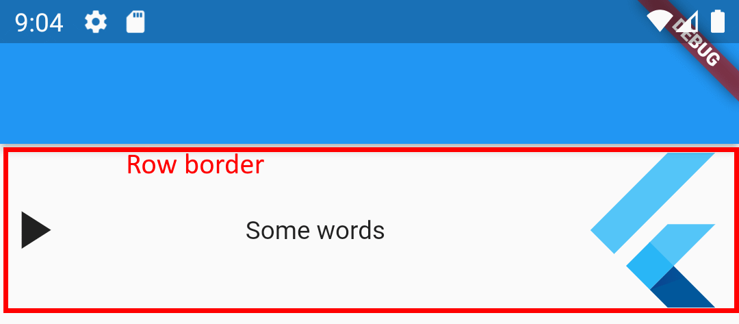
Compare the following to see the effects of the mainAxisSize on the mainAxisAlignment. The red outline represents the invisible border of the Row.
 |
 |
 |
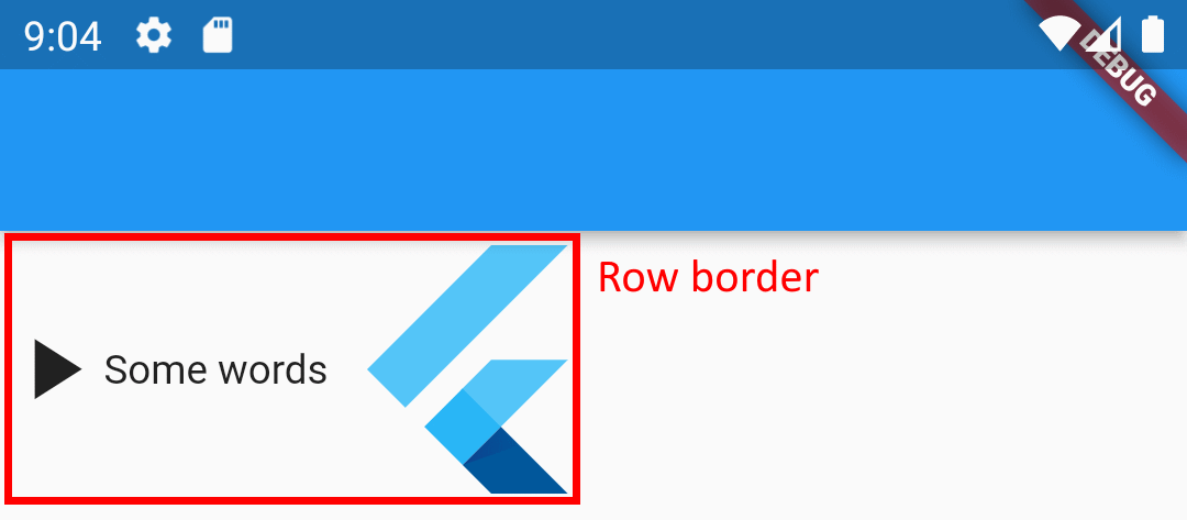 |
As you can see, the second option looks like settings MainAxisAlignment.start. In fact, we have shrunk the size of the row. It doesn’t matter what we put for the MainAxisAlignment when the widget size is set to MainAxisSize.min!
The Row and Column widgets do not have any further control over their sizes than the max or min options. The actual size of Row and Column widgets is largely determined by the size of their children, but can also be controlled by parent widgets like IntrinsicWidth and Expanded.
Conclusion
Row and Column widgets are primitive but powerful. Their main role is to arrange items horizontally or vertically. However, the precise positioning of visible widgets depends on the sizes and layout controls of all the widgets on the screen. The algorithm for determining the exact placement on the screen of widgets is quite complex. We will explore more layout options in future labs.