Containers, Expanded, and Spacer widgets
- Objectives
- Boilerplate
- The Container widget
- Controlling widget size within Rows and Columns - Expanded and Spacer
- Other resources
Objectives
- To understand the role of the Container widget and how to style it
- To use Expanded and Spacer widgets to stretch and space children of Rows and Columns
- To understand the
flexproperty of Expanded and Spacer widgets.
Boilerplate
Create a new Flutter project and copy the code below into lib/main.dart to get started:
import 'package:flutter/material.dart';

void main() {
  runApp(const MaterialApp(
      title: "Containers and Positioning", home: HomeScreen()));
}

class HomeScreen extends StatelessWidget {
  const HomeScreen({super.key});

  @override
  Widget build(BuildContext context) {
    return Scaffold(
        appBar:
            AppBar(title: Text("Spacing"), backgroundColor: Colors.blueGrey),
        body: const Column(children: [
          Row(
            children: [
              TealBox(),
              TealBox(),
              TealBox(),
            ],
          ),
          Row(
            children: [
              TealBox(),
              TealBox(),
              TealBox(),
            ],
          ),
        ]));
  }
}

class TealBox extends StatelessWidget {
  const TealBox({super.key});

  @override
  Widget build(BuildContext context) {
    return Container(
        width: 48,
        height: 48,
        color: Colors.teal,
        margin: const EdgeInsets.all(8),
        child: const Icon(Icons.beach_access));
  }
}
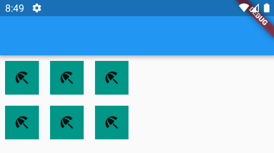
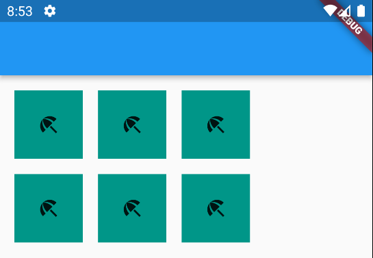
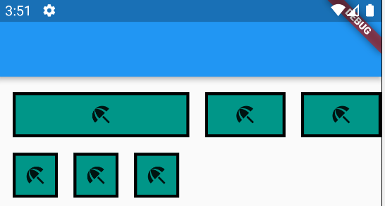
Your app should look like this to start:
The Container widget
The Container widget is a structural widget to help you position, stylize, and size other widgets. Container widgets have a child that the container gives you more control over.
Think of Containers as a general purpose widget for controlling the style and position of a rectangle on the screen. They are a useful tool. If you are familiar with web development, think of Container widgets as the equivalent of a <div>.
Container widgets have several useful properties (which will be familiar if you know web development):
- width and height: numeric values in pixels of the size of the Container.
- padding: the space between the border and the Container’s child widget. Specified using
EdgeInsets. - margin: the space between the border and the widget around the Container. Specified using
EdgeInsets. - color: the color fill of the Container. Specific using
Colors - child: the optional child of the Container.
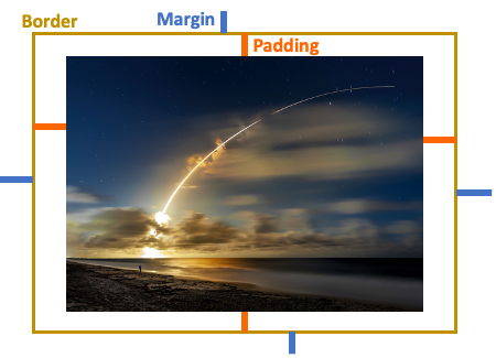
The EdgeInsets widget gives you substantial control over the padding and margin. You can specify EdgeInsets to all sides, to one side, symmetrically (top-bottom, left-right), or to each side with a different value.
Try the following changes to the TealBox widget.
-
Change the margin so that it only has symmetrical left-right margins. Try
margin: const EdgeInsets.symmetric(horizontal: 16). Notice how you have double the margin between containers now.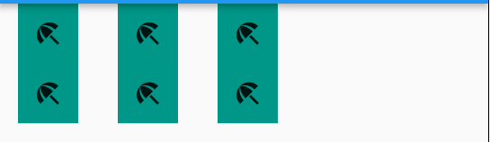
- Maybe you only want a margin on the leading edge. Try `const EdgeInsets.only(left: 16),’
- Okay, but now you want to add some space above and to the left of the Container. Try
const EdgeInsets.only(top: 16, left: 16), -
Looks good. Let’s add some Padding.
padding: const EdgeInsets.all(24),. What happened? Thewidthandheightproperties of the Container are constraining the size of the box, so the Padding is giving us some unintended effects.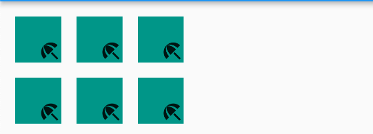
- Delete the
widthandheightproperties. Now what happens?
The Flutter container will resize itself to honor the actual size, the margin, and the padding around its child iff no width or height properties are specified.
Your app should now look like this:
Adding borders to a Container
A Container’s borders are invisible by default. We can make them visible and style them by providing a BoxDecoration widget to the Container’s decoration property.
BoxDecoration has many properties, but not all of them can be used at the same time.
Try the following in order in the TealBox widget:
- First, comment out
color: Colors.teal,on your Container. You cannot specify both acolorproperty and thedecorationproperty on a Container or you will get an exception. - Add the parameter
decoration: BoxDecoration(color: Colors.teal),. The boxes should look the same as before. - Add
border: Border.all(width:3),to the BoxDecoration. You should now see the border.- You can specify on which sides you want the border. For example
border: Border(bottom: BorderSide(width: 3))will place only a bottom border. You can specify any combination of top, bottom, left, or right.
- You can specify on which sides you want the border. For example
-
You can round the Container’s corners by adding
borderRadius: BorderRadius.circular(24),to the BoxDecoration. Vary the numeric value to see the effects.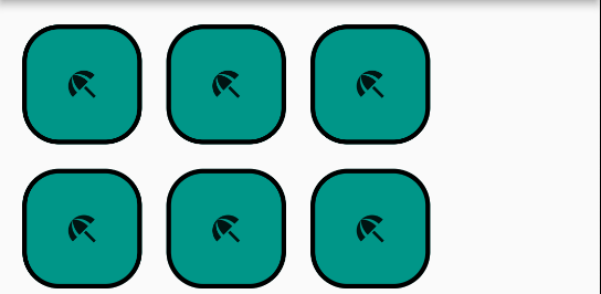
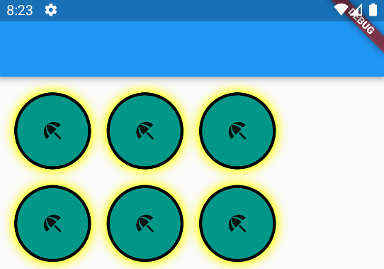
- Maybe you want your Containers to have a shadow. This is a little more complicated. Add the following property to your
BoxDecoration:boxShadow: const [ BoxShadow( color: Colors.yellowAccent, blurRadius: 8, spreadRadius: 3, ) ]Note that
boxShadowtakes a list ofBoxShadowobjects – you can specify more than one shadow. - Maybe you like your Containers circular instead of rectangular. Comment out the
borderRadiusproperty and addshape: BoxShape.circle,
In the end, you should have something resembling this:
A word on Container performance
Containers are a very customizable, general purpose widget. You can wrap them with a GestureDecorator to achieve interactivity a well.
This flexibility comes at a cost – it takes a bit more time to construct and draw Container elements under the hood. You will likely not notice the difference unless you have many containers on the screen, and they are being redrawn many times in response to user interaction.
So while Containers can get you the rectangle you want, it is better from a performance perspective to use other built-in widgets if they suit your needs:
- Consider a DecoratedBox if all you need is a stylized square. You can wrap it with Padding or SizedBoxes to get spacing.
- If you’re looking for a button, Flutter has a variety of pre-made Buttons available with callbacks for
onPressedandonLongPressbuilt in.
Controlling widget size within Rows and Columns - Expanded and Spacer
Rows and Columns are a strong basis for arranging widgets. Sometimes we want to size the widgets inside of a Row or Column to have a size that is proportional to its siblings. Or we may want to have one widget larger than the others, or fill all the “extra” space in our row or column.
- First, let’s simplify our TealBox again. Comment out the
borderRadius,shape, andboxShadowproperties. - Set the
paddingproperty to a smaller value, likeEdgeInsets.all(8).
Grow a child the Expanded widget
Note: Our example uses Rows, but everything here applies to Columns as well.
Now, go to the HomeScreen widget. Suppose we want the left-most widget in the top row to be as large as possible while still leaving room for the other boxes in the row.
- Wrap the first
TealBox()with anExpandedwidget like so:Expanded(child: TealBox()),. What happens?- Why is the right-most widget abutting the edge of the screen? Because we only have left and top margins on those widgets.
- Try wrapping the last TealBox in the first row in
Expandedas well. What happens? - Now add Expanded to the middle box. What happens?
In general, the Expanded tells a Widget to grow to fill as much space as possible. If multiple widgets are Expanded, they will divide the space evenly.
Flexing
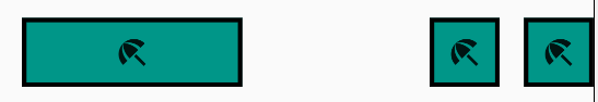
You can tell widgets to Expand and control the proportion of each widget using the flex property. Replace your first Row with the following:
Row(
children: const [
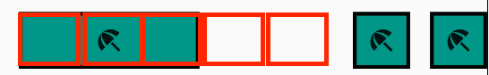
Expanded(flex: 4, child: TealBox()),
Expanded(flex: 2, child: TealBox()),
Expanded(flex: 2, child: TealBox()),
],
),
You should see something like the following:
What is going on? Flutter sums up all the flex values of the Expanded widgets, in this case 4+2+2=8. Flutter divides the Row into 8 equally-sized cells, like below:
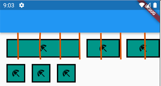
Flutter draws each widget over flex # of cells. So the first box gets 4 cells, and the other two get 2 cells each.
You can set the flex values to be any integers you want. The general formula that describes the size of a flexed widget is remainingSpace * (flex / totalOfAllFlexValues). The default flex value is 1. This flex model is similar to the grid model of popular web styling frameworks such as Bootstrap.
Try changing the flex values to 3, 1, 2 for the first row’s children and observe the effects.
The Expanded widget and its flex values will scale to different screen sizes. To test this, try creating a different phone with your emulator, or use Chrome as a target if you have Chrome installed.
Keep ‘em separated with the Spacer widget
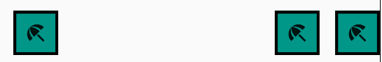
In a previous lab, we discussed the mainAxisAlignment property of Rows and Columns and how it can be used to arrange child widgets. Specifically, the spaceEvenly, spaceBetween, and spaceAround options distribute the whitespace around a Row/Column’s children in specific pre-determined patterns. But, maybe you want a different pattern, like the one below:
When you want more control over whitespace in a Row/Column, we use a Spacer widget. Replace the second Row in HomeScreen with the following:
Row(
    children: const [
        TealBox(),
        Spacer(),
        TealBox(),
        TealBox(),
    ],
),
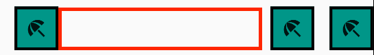
The Spacer widget is similar to the Expanded widget, except that the Spacer expands the blank space rather than a child widget. You have added a transparent Spacer widget that is filling the space:
Place a second Spacer() between the second and third TealBoxes. Does this look familiar? It is exactly the same as specifying mainAxisAlignment: MainAxisAlignment.spaceBetween, on the Row! (Note: There is some extra whitespace to the left of the first box because the boxes have a left margin.)

By default, multiple Spacer widgets in a Row/Column will divide the whitespace evenly among themselves.
Flexing
Spacer widgets use the same “flex” rules as Expanded widgets. The default flex value is 1, which is why multiple Spacers divide the whitespace evenly.
Set the flex: 2 on the first Spacer, and flex: 1 on the second Spacer. You have divided the whitespace into 3 equally-sized cells, and each Spacer gets “flex” number of cells.
Combining Expanded and Spacer widgets
The next logical question is, can you combine Expanded and Spacer widgets to achieve fancy geometric layouts? The answer is “Yes!”
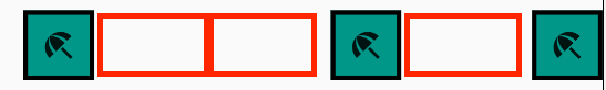
Suppose that we want to have a widget on the left side that’s as wide as possible. Then we want a lot of space, then two smaller widgets on the right side with only a little space between them. Change your second row to the following:
Row(
    children: const [
        Expanded(flex: 3, child: TealBox()),
        Spacer(flex: 2),
        TealBox(),
        TealBox(),
    ],
),
The flex values of all Spacer and Expanded widgets within a Row/Column are shared. Remember, Flutter uses flex values to determine what to do with the whitespace left over in a Row/Column after drawing visible children.
Flutter sums up the flex values (3+2=5), divides the whitespace into 5 cells, then assigns 3 cells to the Expanded widget and 2 cells to the Spacer widget. Note that we still have some left-side margin on the TealBoxes.