More Layout Widgets
- Objectives
- Class recording
- Boilerplate
- Align widget
- Padding widget
- Wrap widget
- Stack
- Other resources
Objectives
- To learn the purpose of the Align, Padding, Wrap, and Stack widgets
- To introduce the powerful MediaQuery widget.
Class recording
Boilerplate
Create a new Flutter project replace the default main.dart with this: main.dart.
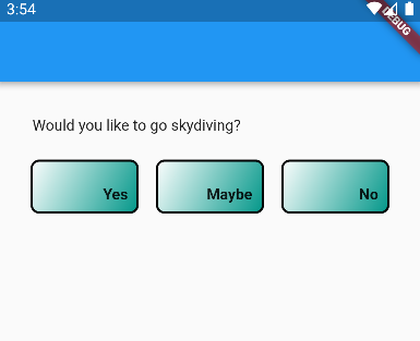
Your starting point should look like this:
Align widget
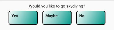
The Align widget helps specify where a child widget should appear inside a parent widget.
Suppose we want to move the “Would you like to go skydiving?” question to the left side of the screen but keep the buttons in the center. We could accomplish this with the crossAxisAlignment property of the Column, however, that would also move the buttons.
Instead, wrap the top Text widget in an Align widget with
alignment: Alignment.centerLeft property, like so:
  Align(
    alignment: Alignment.centerLeft,
    child: Text("Would you like to go skydiving?"),
  ),
Because there is extra horizontal space around the Text widget, the Align widget is able to move it to the left side of the Column.
The attribute alignment: Alignment.centerLeft, specifies where the child should go within the parent. There are several pre-baked alignment values, or you can pass numeric arguments to precisely control the alignment as a function of the x and y axes.
An Align widget’s child will only move if there is extra space for it to move, so if the parent is tightly wrapping the child, you will not see a change.
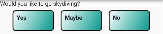
Let’s make another change. Our PrettyButtons are Containers with Text widgets (the button labels) as children. The Containers are larger than the Text widgets, so there is some “wiggle room” to move them around within the Container.
Wrap the PrettyButton’s Text widget with an Align widget like so:
  child: Align(
    alignment: Alignment.bottomRight,
    child: Text(
      buttonText,
      style: const TextStyle(fontWeight: FontWeight.bold),
    ),
  ),
Note the changes in the button labels:
Padding widget
We have already encountered padding in our Container lab. Generally speaking, padding is the space between the border of a widget and its content, e.g., the space between the edge of a Container and its Text child.
The Padding widget allows you to create padding around any child widget, including Text, Buttons, Rows, Columns… anything really. Padding is ideal for creating space between widgets.
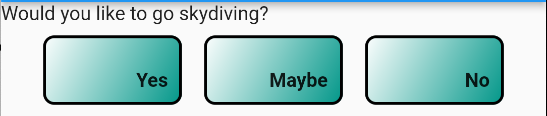
Our “Would you like to go skydiving?” Text header could use some breathing room. Wrap it in a Padding widget like so:
  const Padding(
    padding: EdgeInsets.all(16),
    child: Align(
      alignment: Alignment.centerLeft,
      child: Text("Would you like to go skydiving?"),
    ),
  ),
Our Text header now has some more breathing room:
Padding widgets have a padding: property that takes an EdgeInsets that specifies on which side the padding should be placed. Using EdgeInsets, you can specify a uniform padding around all sides (.all()), selectively on the vertical and/horizontal axes (.symmetric()), or individually on the left, right, top, or bottom (.only()).
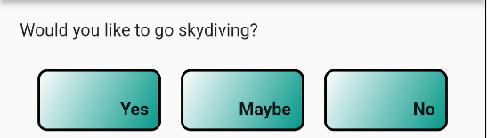
Wrap the main Column widget inside the Scaffold in a Padding widget with 16 pixels of space on all sides - EdgeInsets.all(16). It is a common practice in mobile and web application development to provide a padding around all the content on the screen. This provides some cushion to the Column and its contents from the edges of the screen.
Wrap widget
What happens when not all of the children of a Row or Column fit on the screen? Add another PrettyButton to the Row with the label “Why would you even ask that?” You should see something like the following:
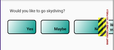
If you look at the Debug Console, you’ll also see an Exception has occurred:
════════ Exception caught by rendering library ═════════════════════════════════
The following assertion was thrown during layout:
A RenderFlex overflowed by 103 pixels on the right.

The relevant error-causing widget was
Row
lib/main.dart:28
You can inspect this widget using the 'Inspect Widget' button in the VS Code notification.
The overflowing RenderFlex has an orientation of Axis.horizontal.
The edge of the RenderFlex that is overflowing has been marked in the rendering with a yellow and black striped pattern. This is usually caused by the contents being too big for the RenderFlex.

Consider applying a flex factor (e.g. using an Expanded widget) to force the children of the RenderFlex to fit within the available space instead of being sized to their natural size.
This is considered an error condition because it indicates that there is content that
The exception says that “The relevant error-causing widget was Row”. The yellow-and-black mark on the screen is a “RenderFlex error”, which means that Flutter couldn’t fit all the widgets in the Row on the screen given their desired sizes and drawing constraints.
That last button is too big to fit in the Row. So what do you do?
- We could declare a new Row and move that last button to it, but it would actually be nice to have all buttons in the same row in case someone with a wide screen (like a tablet) or landscape mode uses our app.
- We could make the Row scrollable, though horizontal scrolling is generally frowned upon.
- We could wrap the overflowing content to the next line automatically.
Option 3 is the purpose of the Wrap widget. A Wrap widget functions much like a Row or a Column, with the ability to overflow gracefully. The Wrap widget takes the place of the Row/Column, and you specify the direction that the Wrap’s children should fill – horizontally like a Row or vertically like a Column.
Replace the Row widget with a Wrap widget as follows:
  Wrap(
    direction: Axis.horizontal,
    alignment: WrapAlignment.center,
    children: const [
      PrettyButton("Yes"),
      PrettyButton("Maybe"),
      PrettyButton("No"),
      PrettyButton("Why would you ask such a stupid question?"),
    ],
  )
You should now see the following:
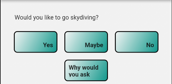
The Wrap widget will automatically move overflowing widgets into the next run. A run is a row or column in the Wrap widget. The screenshot above has two “runs”.
Our example shows Row-like behavior. Wraps can also be used to create wrapped Columns as well. Wraps can also be children of widgets that are smaller than the screen size, like Containers with a fixed size. For example, maybe you want to wrap a bunch of thumbnail images inside a Container that is only 1/3 the height of the screen.
Wrap widgets have several properties:
direction:Axis.horizontalfor Row behavior, orAxis.verticalfor Column behavioralignment: takes aWrapAlignmentobject with options similar toMainAxisAlignmenton a Row/Column along thedirectionaxis. This specifies how the children will be aligned within runs.crossAxisAlignment: takes aWrapCrossAlignmentobject similar toCrossAxisAlignmenton a Row/Column. Wrap - direction and alignmentrunSpacing: how much margin to put between runs.runAlignment: how to align the runs themselves, e.g., all runs should be aligned on the left side, or to the center, etc.
Replace your Row or Column widgets with a Wrap widget when you know that overflow is a possibility and you want to “grow” you want to expand your list of widgets into the next row or column automatically.
“Wrapping” is not always the desired solution; sometimes you may prefer to scroll the content instead. Scrollables will be covered in a future lab.
Stack
Examples of the Stack widget are forthcoming.